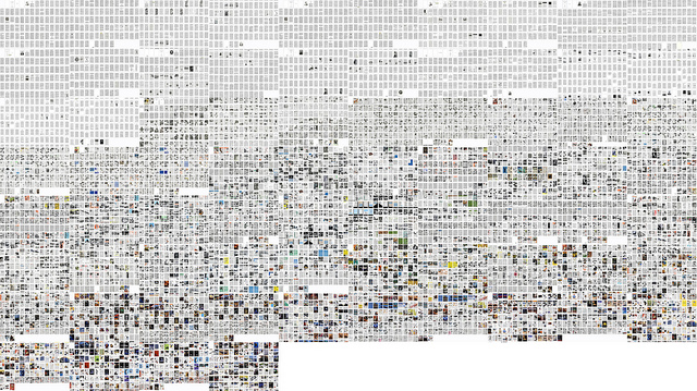
Found this epic visualisation of the US magazine: Popular Science. It shows how over the las 125 years the temporal changes from a visual point of view. As we get closer to current day, the magazine is more image lead. Does this mean we are dumbing down? Or that an image can speak a thousand words? Click for the high-res version. And see more about the great work on this visualisation at the Software Studies Initiative over at UCSD.

Comments