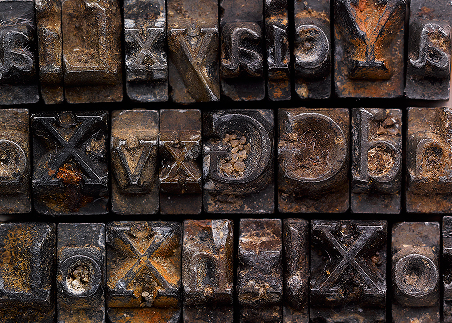
We are digging this story about a lost type face. In the early 1900s type was set using metal blocks unlike todays digital fonts used on websites and in print design applications. It was around this time that Thomas Cobden-Sanderson commissioned a bespoke typeface for the Doves printing firm which he co-founded with Emery Walker in 1900. It was a modern take on a Venetian serif and was used for the majority of books printed by Doves Press. In 1916 the two owners fell out when the company was dissolved. Cobden-Sanderson feeling aggrieved, spent nine months tipping over 2 tones of it into the River Thames so his partner could not reuse it.
In modern times the font had been recreated most notably by typographer Robert Green. He decided in late 2014 to see if he could find any of the original type on the foreshore of the River Thames near Hammersmith bridge where it was dumped in 1916. He was successful in finding some of the metal type, and had been refining the digital version of the type as a result. Read more over at Creative Review

Comments